The Problem
Honeywell, as a large international corporation, lacked a unified design system, which led to inconsistent user experiences across its various business units. The major challenge was to rebuild the entire DLS from scratch and introduce it to a vast global organization, accounting for thousands of variables across five continents.
My Role
I was part of a global DLS team tasked with rebuilding the design language based on a new, customer-centered approach. My role was to help create a well-documented and extensible system that would ensure brand consistency and improve the end-user experience across all of Honeywell’s software.
The Approach
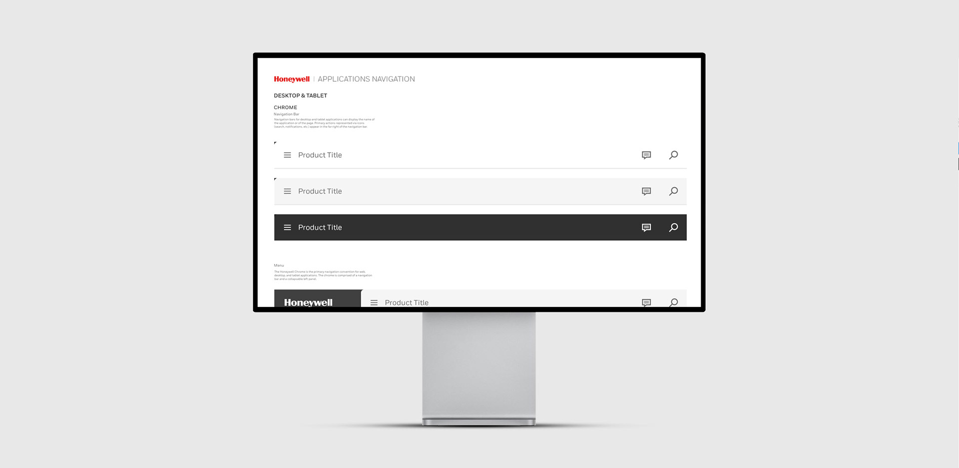
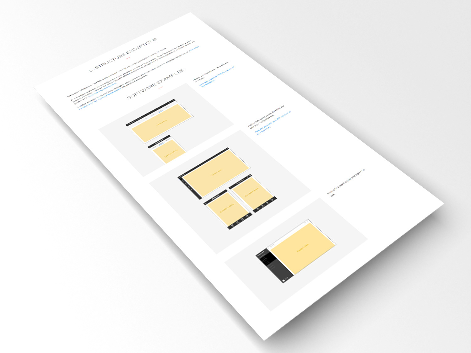
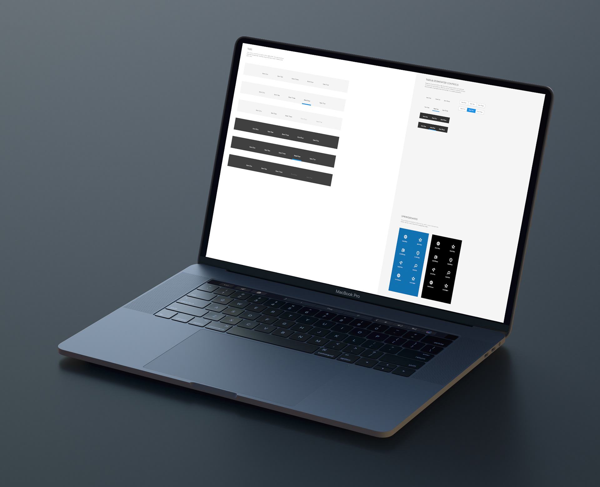
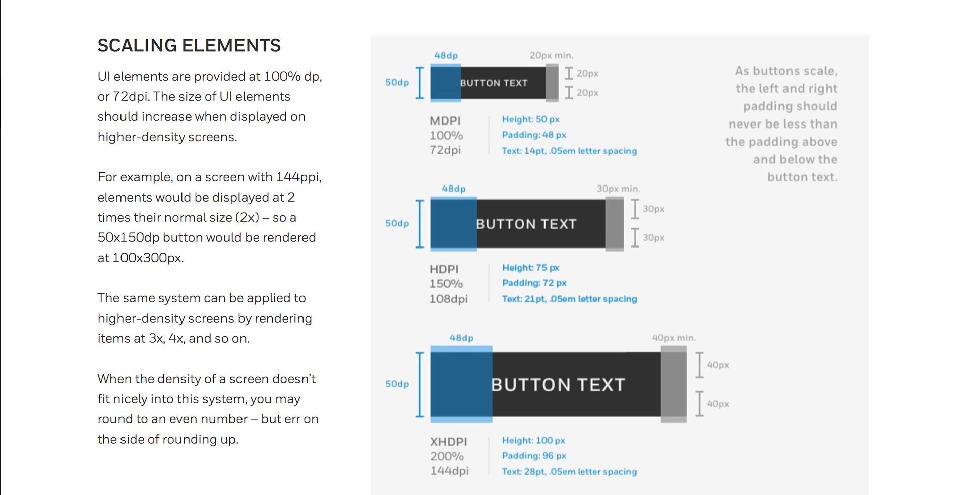
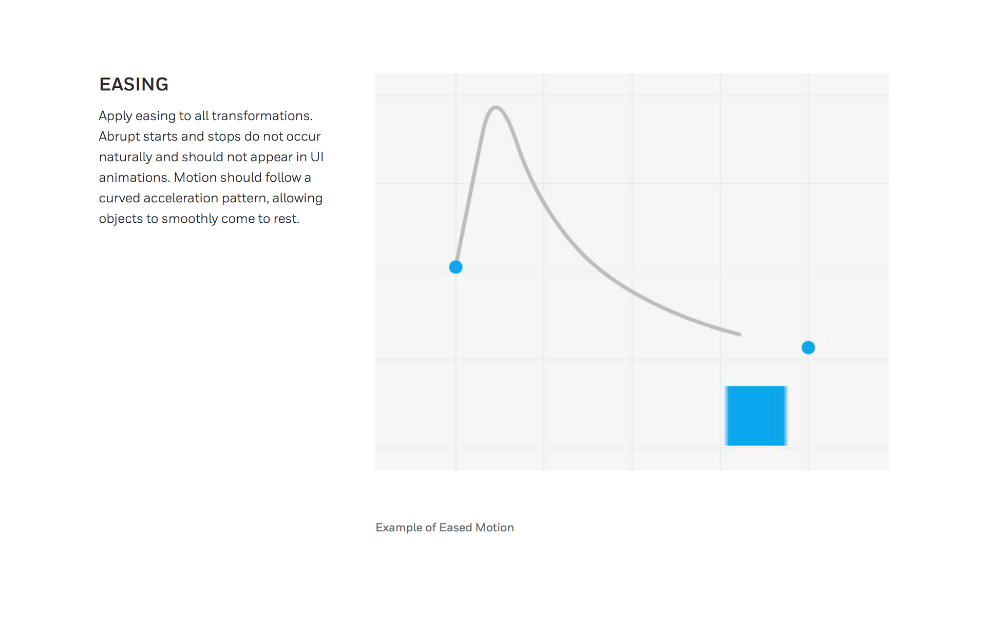
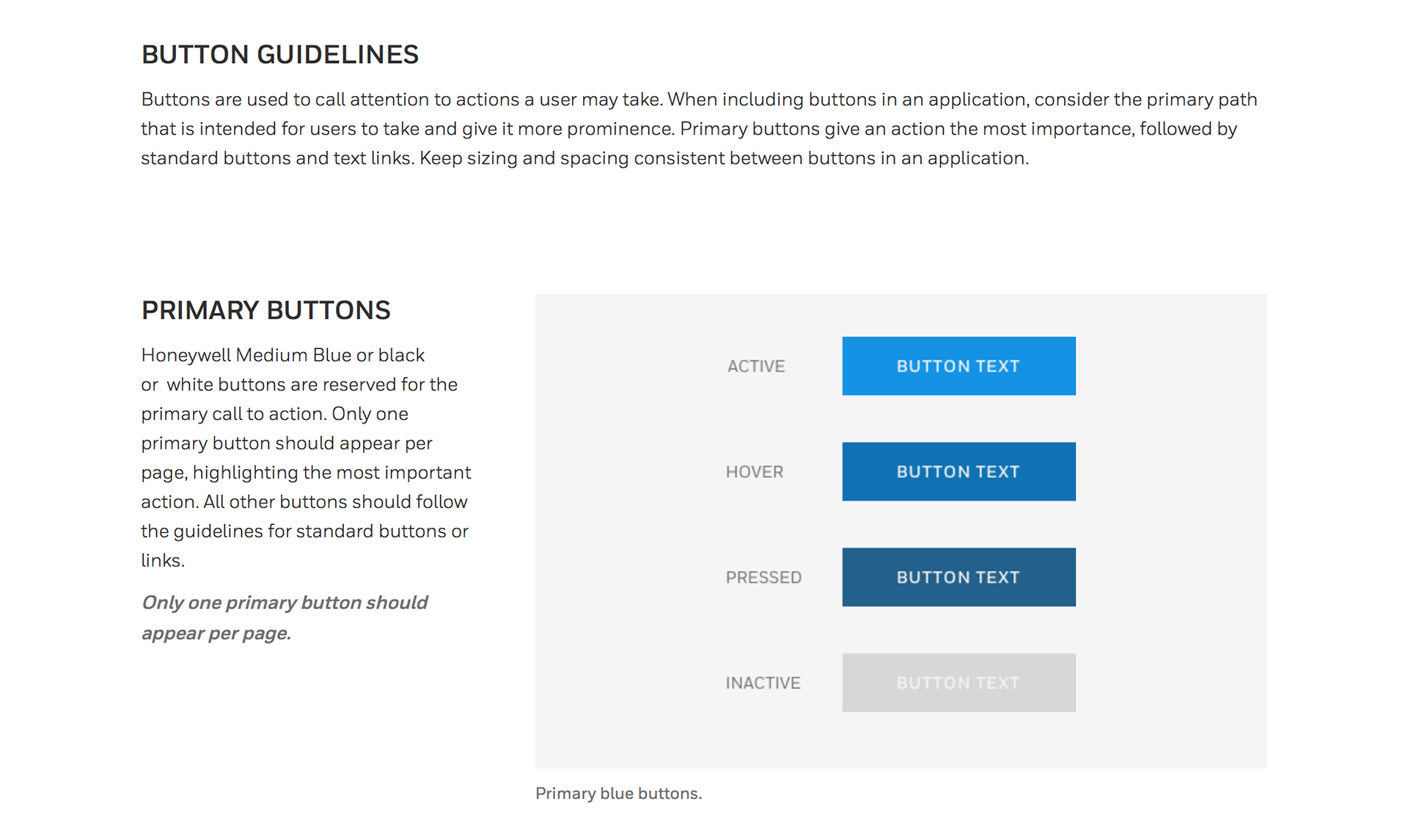
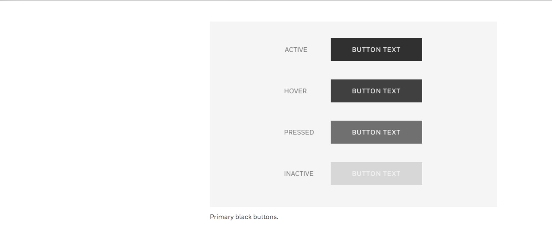
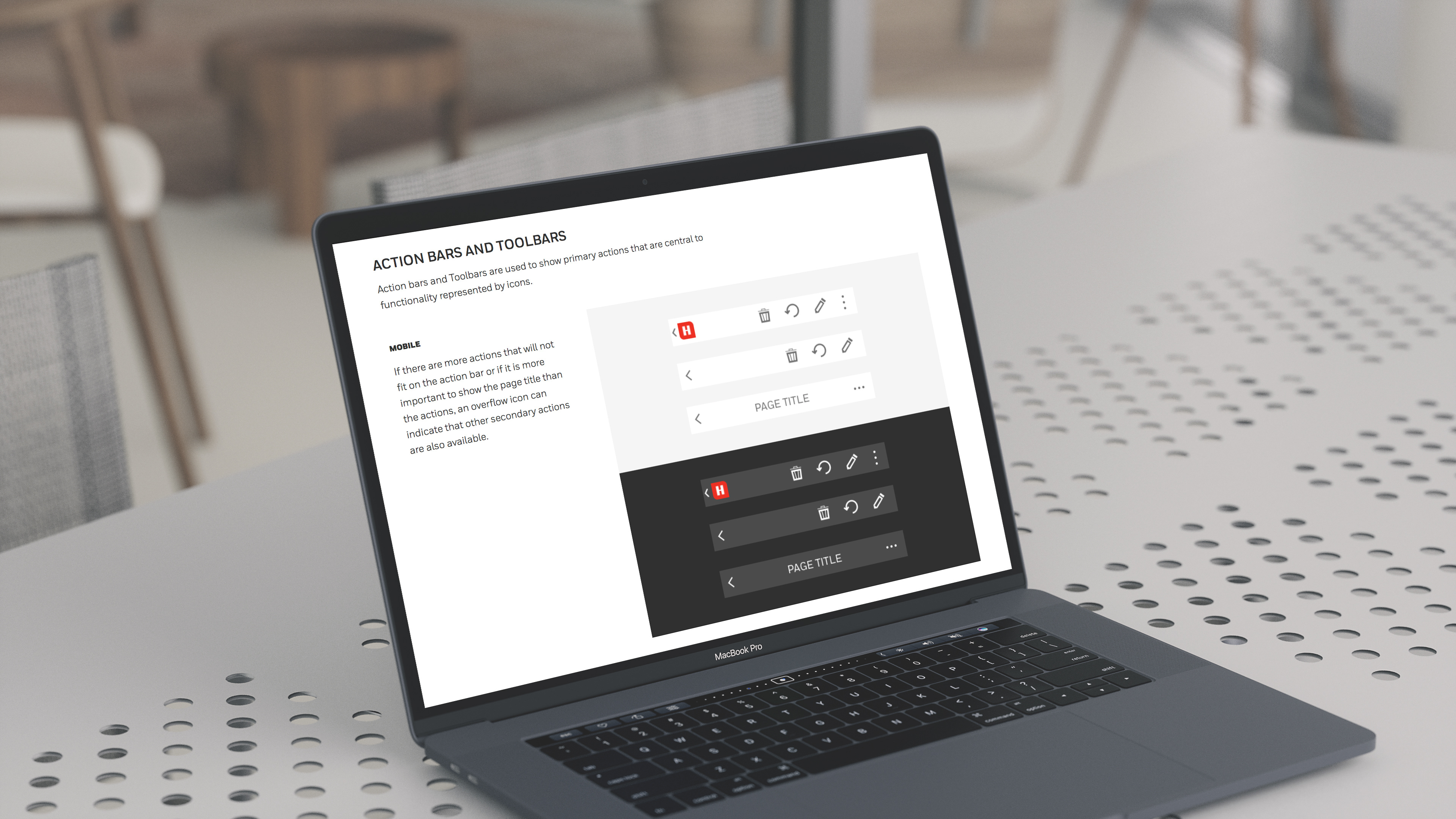
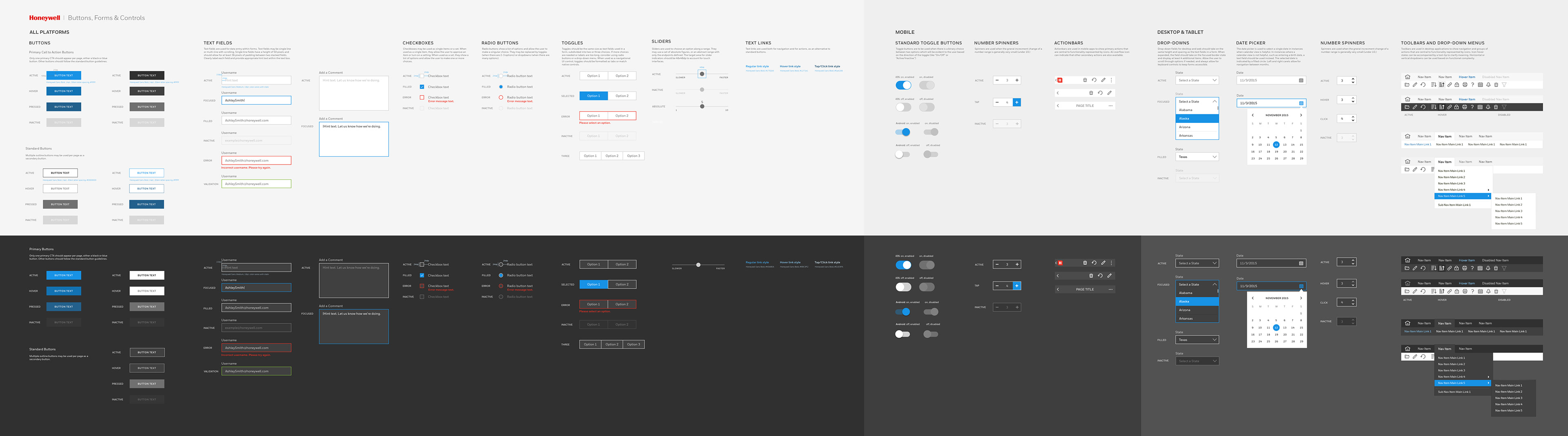
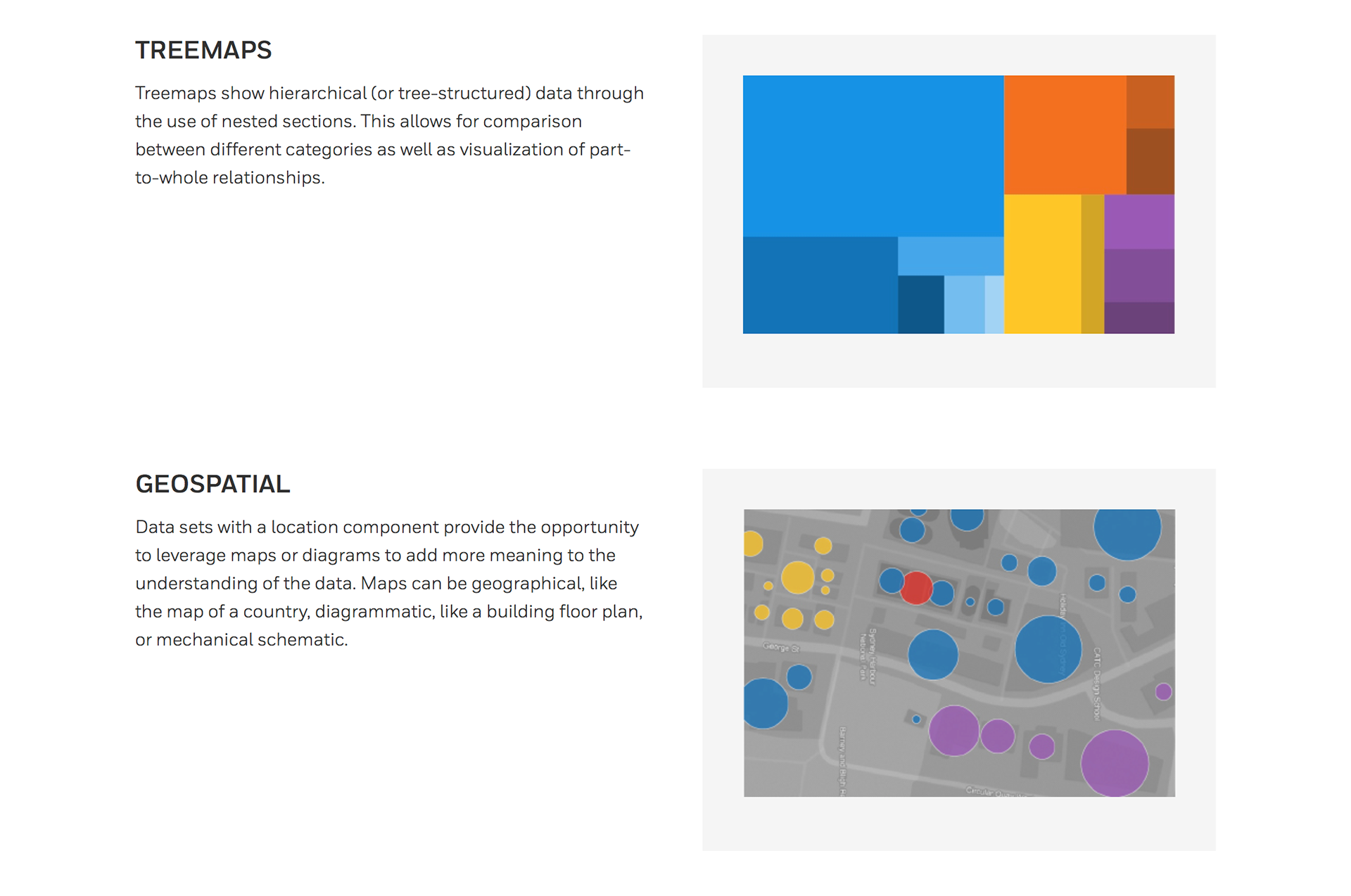
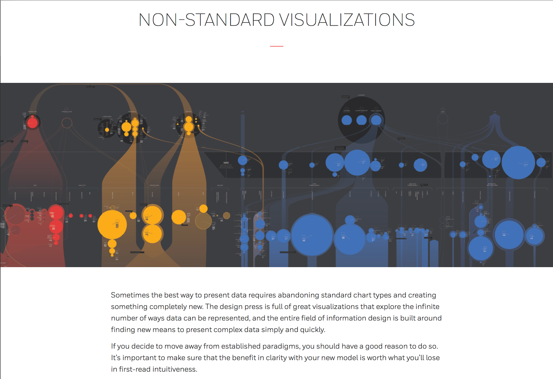
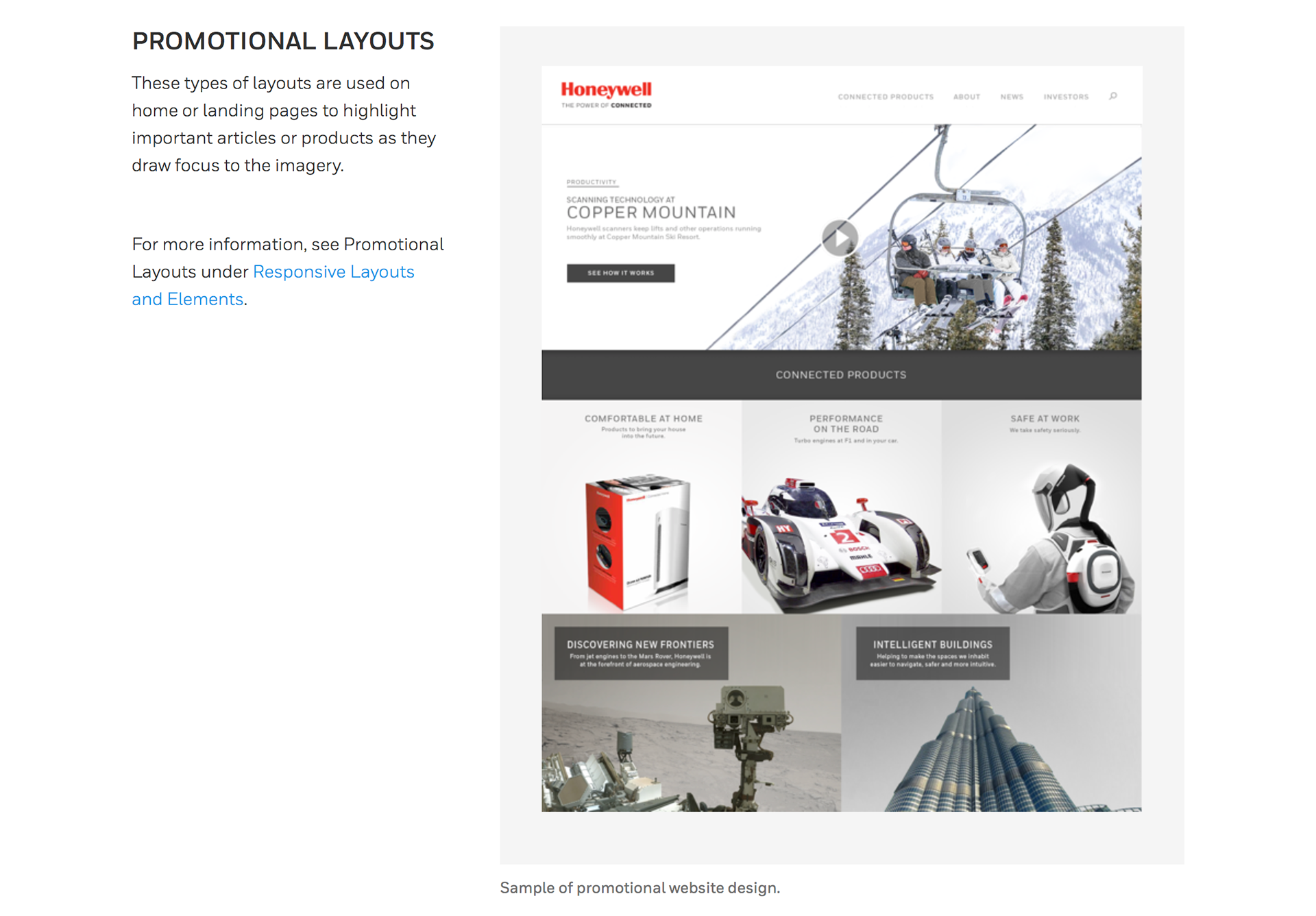
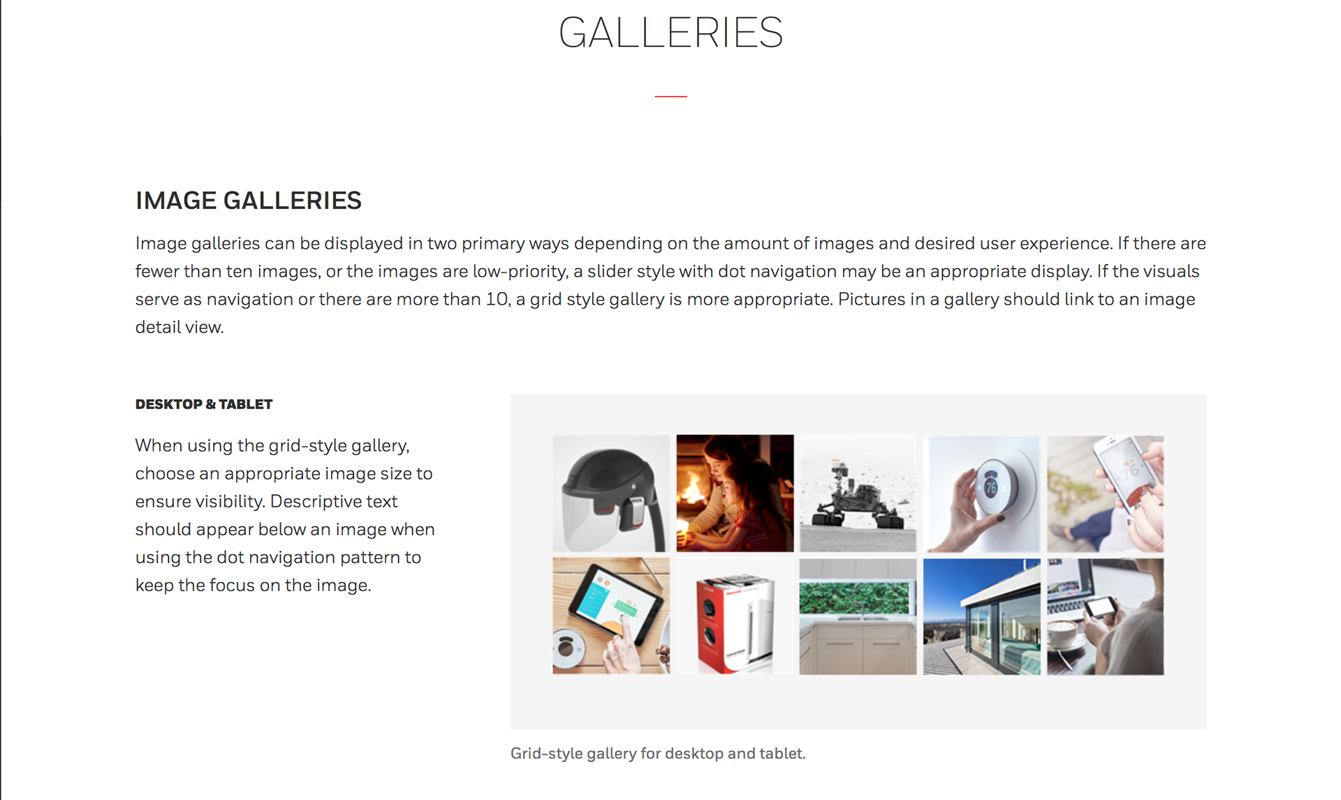
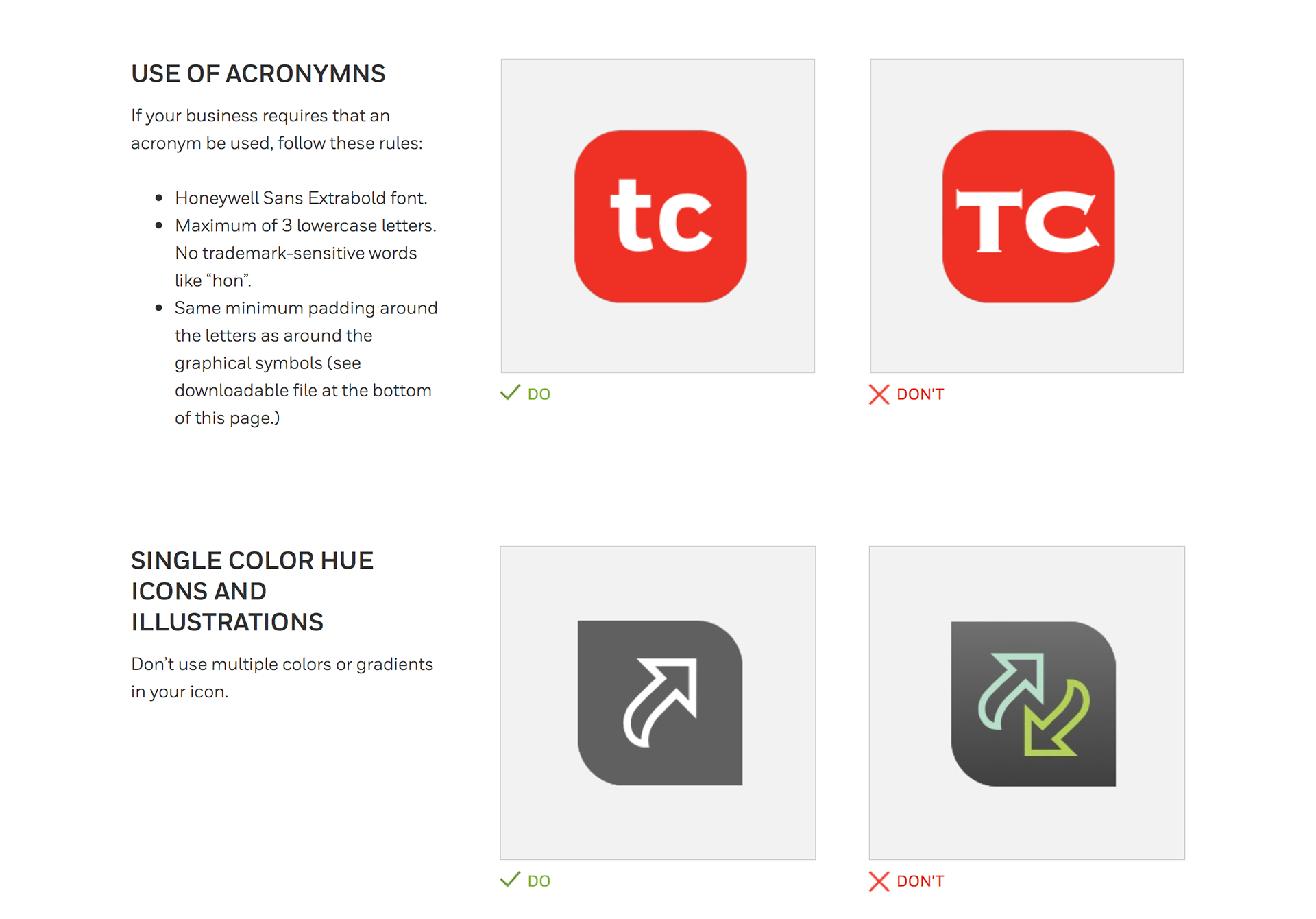
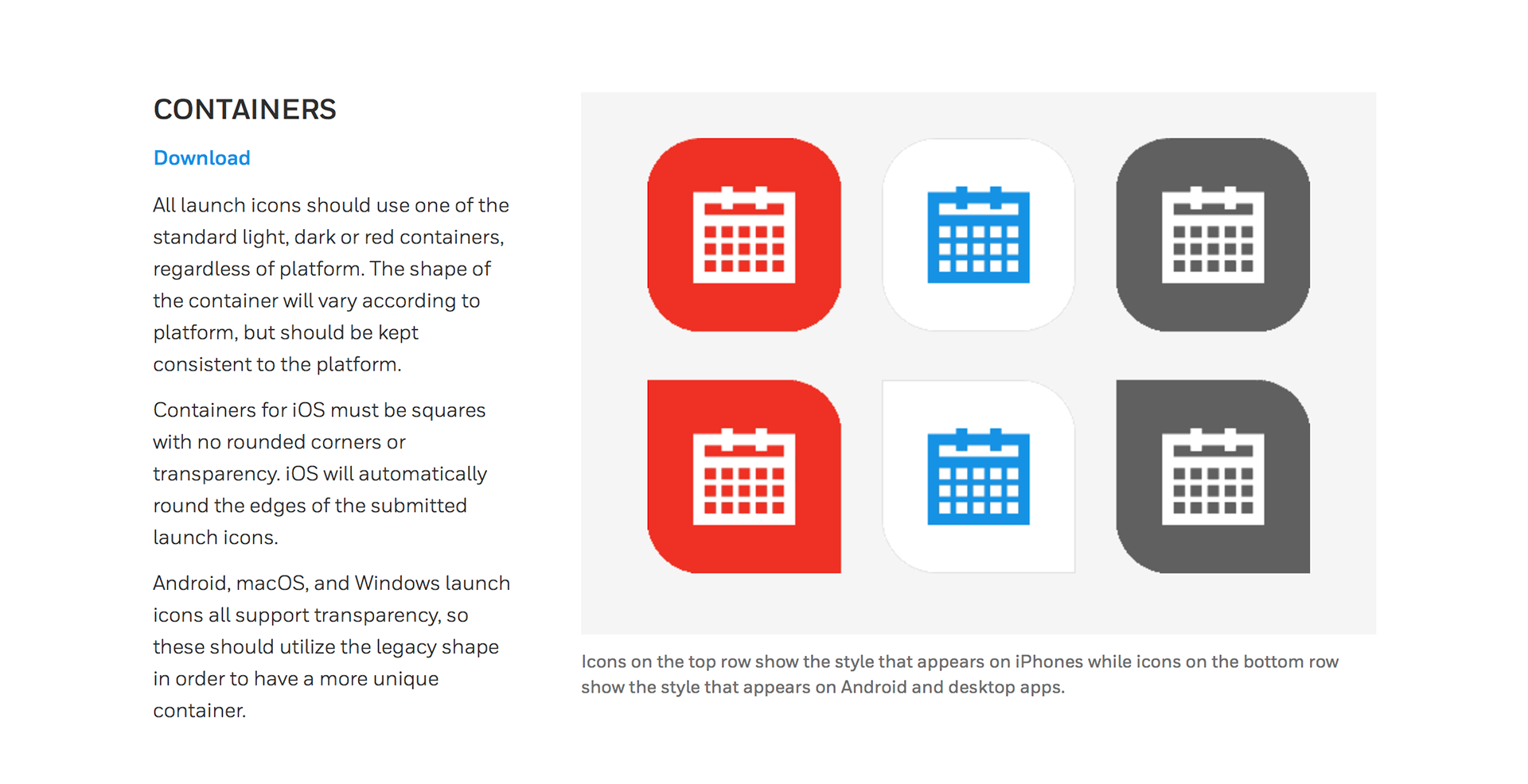
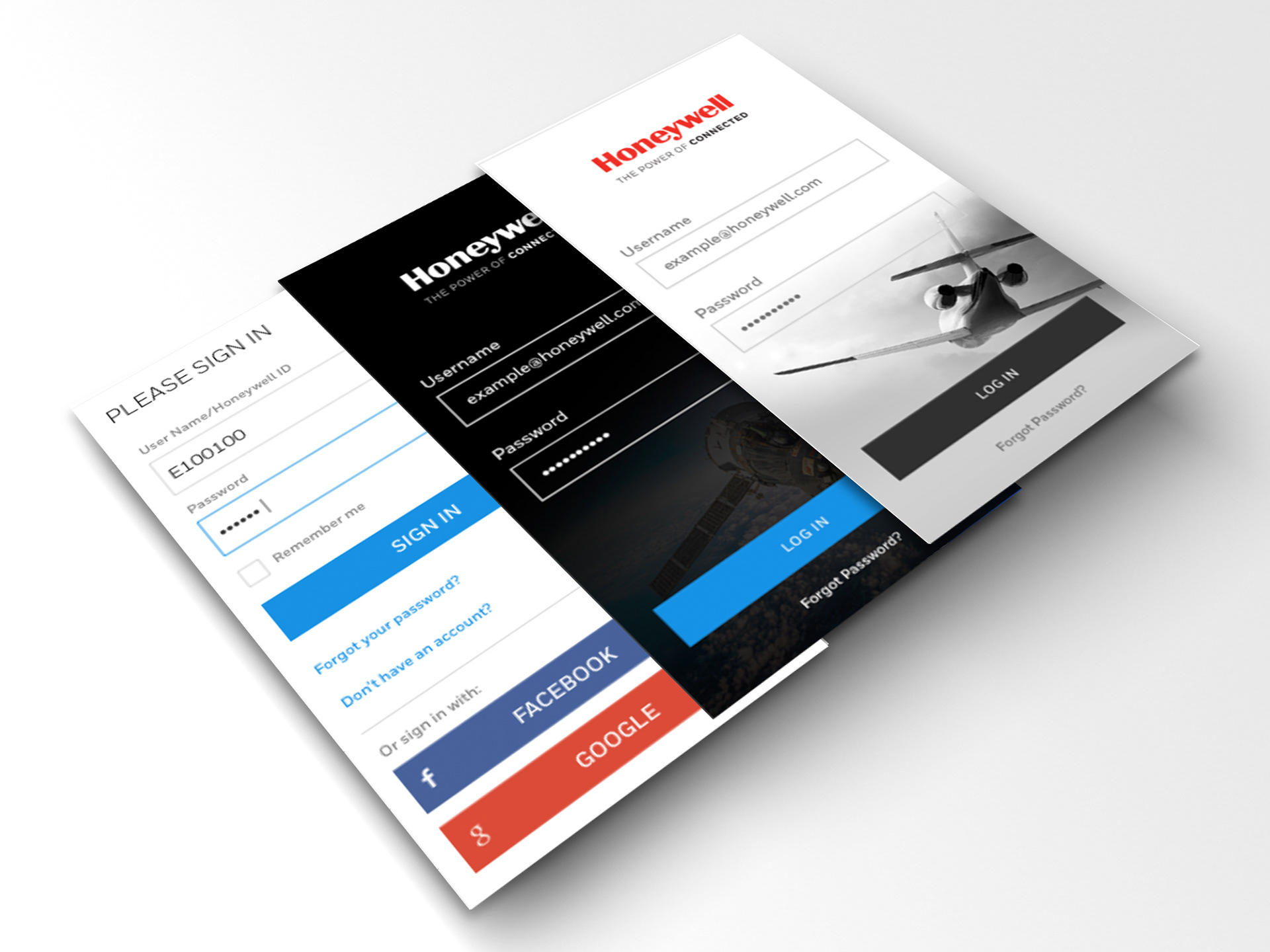
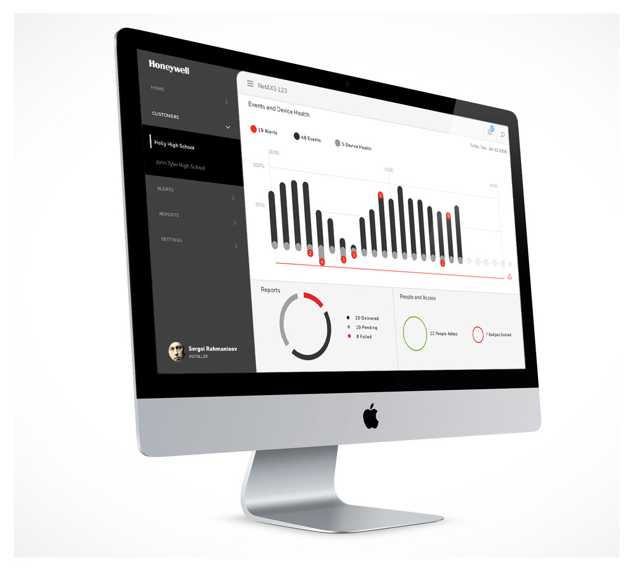
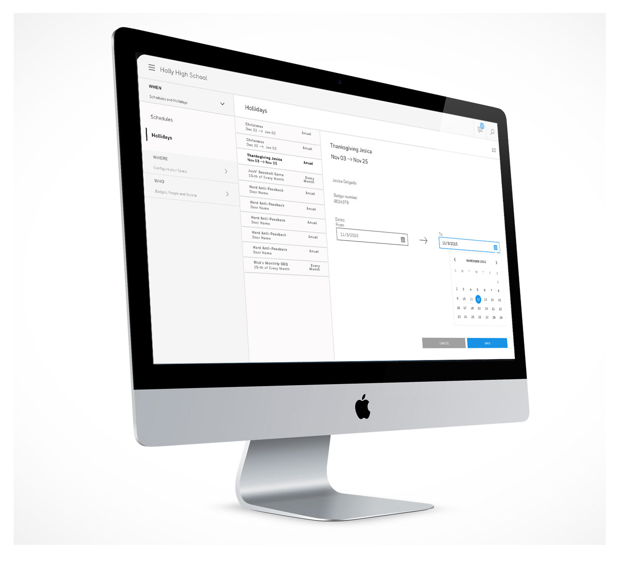
Our approach was to collaborate closely with each product team, starting with "hero" applications from Honeywell's major business groups. We then abstracted these designs and learnings to define the system's content and structure, which was built around three key elements: Principles, Components, and Patterns. We established foundational principles for brand and layout, created a library of reusable components, and defined patterns for common UI elements.
The Solution
We created a modular and extensible DLS that could be easily shared across Honeywell's business units. This system included everything from design tokens like colors and typography to foundational UI components, providing a common platform for all digital products. We also developed a central online design center to serve as a repository for all the design and engineering teams.
The Outcome
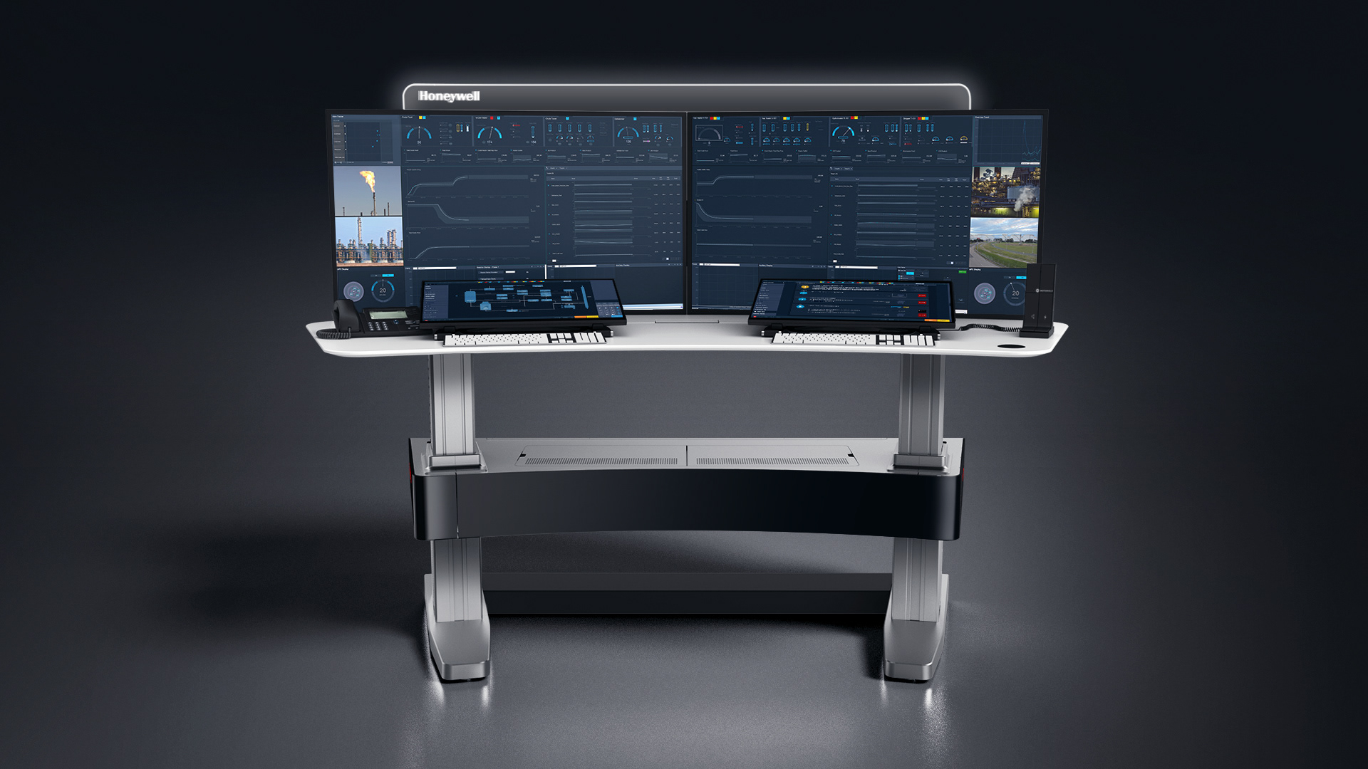
The new DLS enabled Honeywell’s teams to quickly design and build a wide range of products, from complex interfaces to marketing materials, with newfound consistency and efficiency. The system created a common platform that could evolve with the company, successfully unifying the user experience across all digital properties.


See other projects