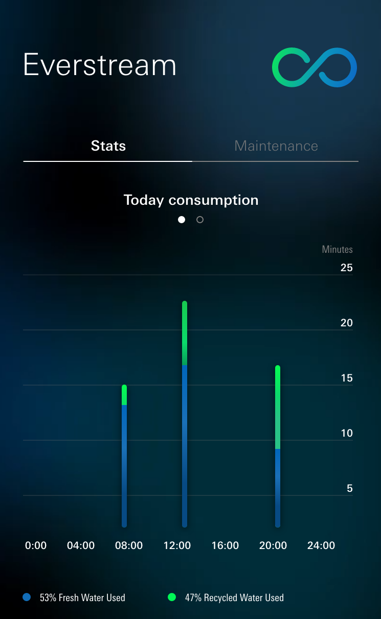
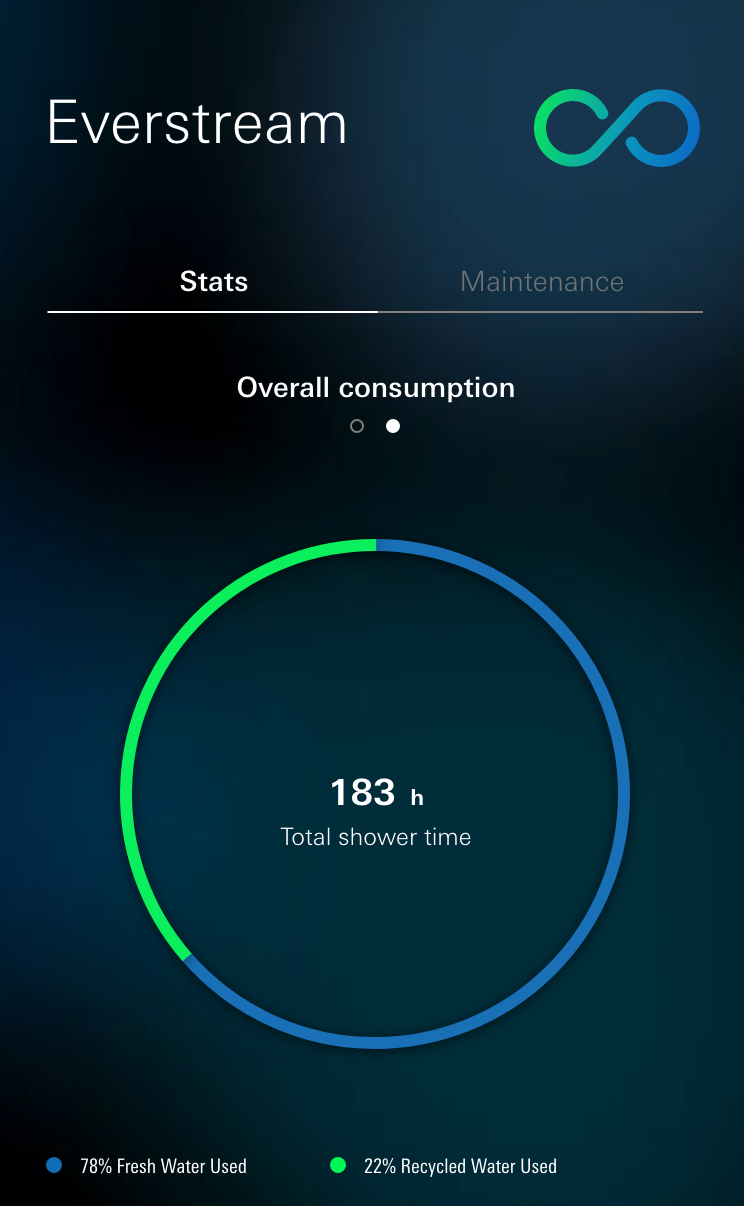
Clarify: Set a clear objective that resonates with your audience. LIXIL/Grohe Everstream Digital Shower mobile application. B2C.
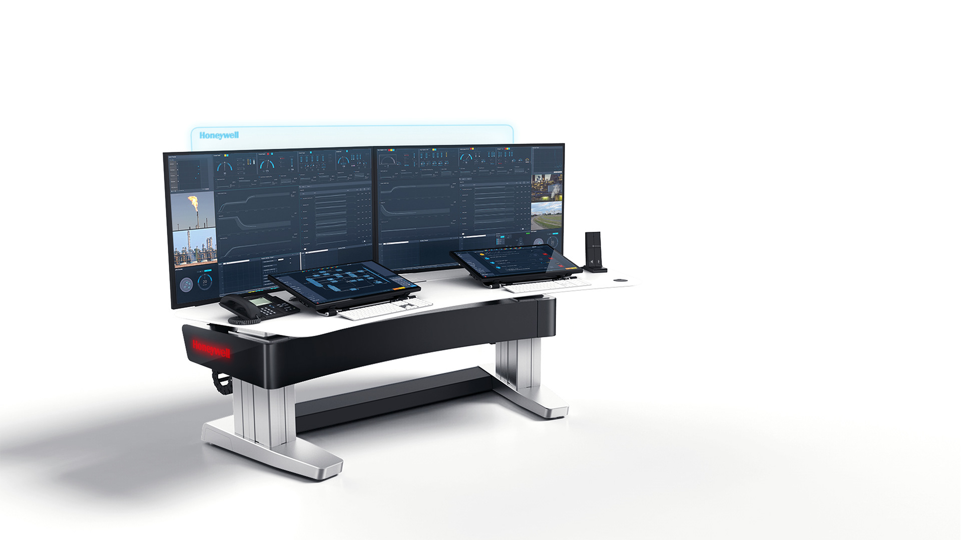
Form Follows Function: Design your visualization based on its intended purpose. Honeywell Connected Buildings - Cloud Gateway project. B2B.
Provide Context: Explain the significance of your data, provide labels, and include relevant axes and legends to help viewers interpret the visualization. Honeywell Connected Buildings project. B2C.
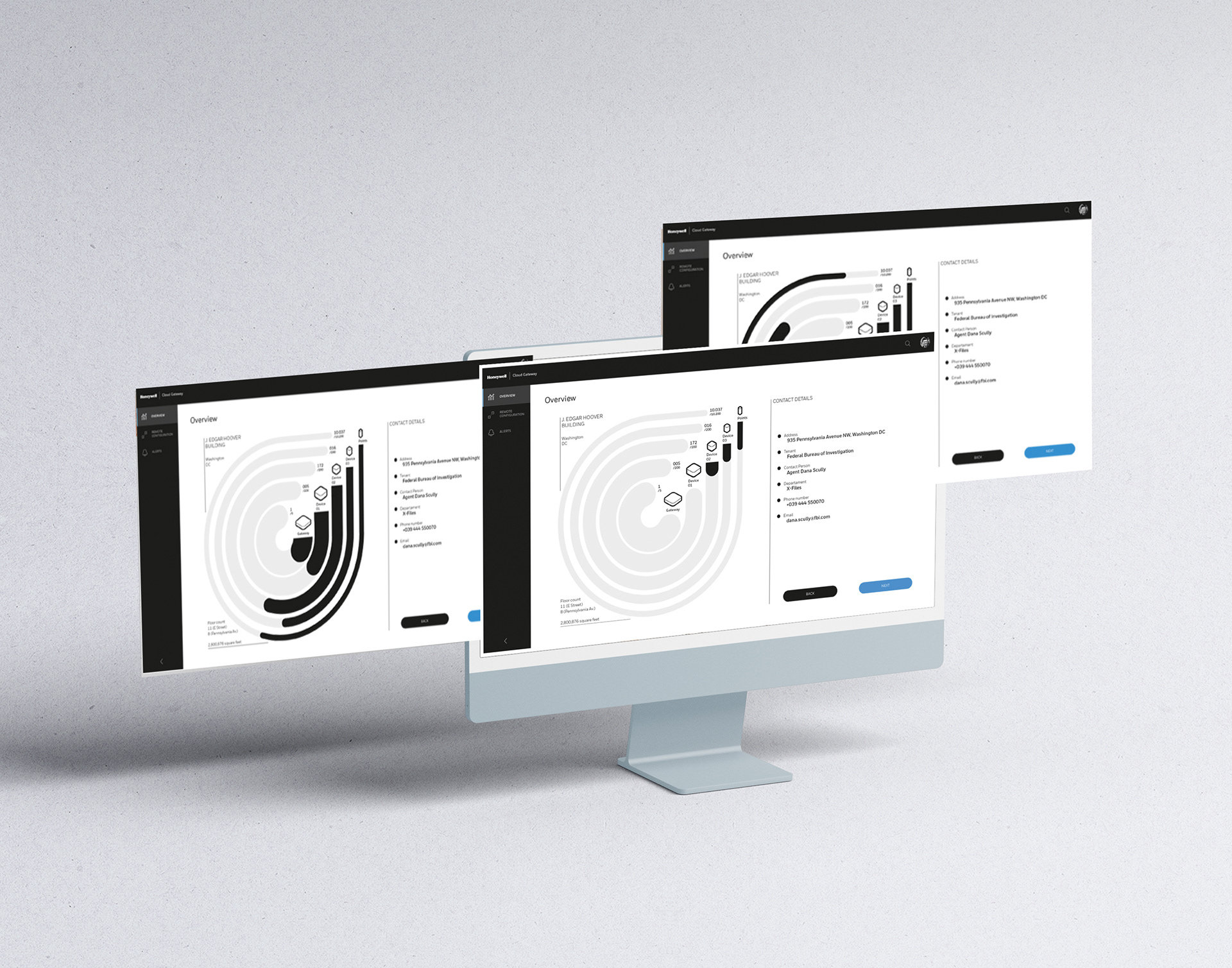
Direct Attention: Highlight important details. Use visual cues like color, size, and position to guide viewers’ attention to relevant information. Honeywell Connected Buildings - Cloud Gateway project. B2C.
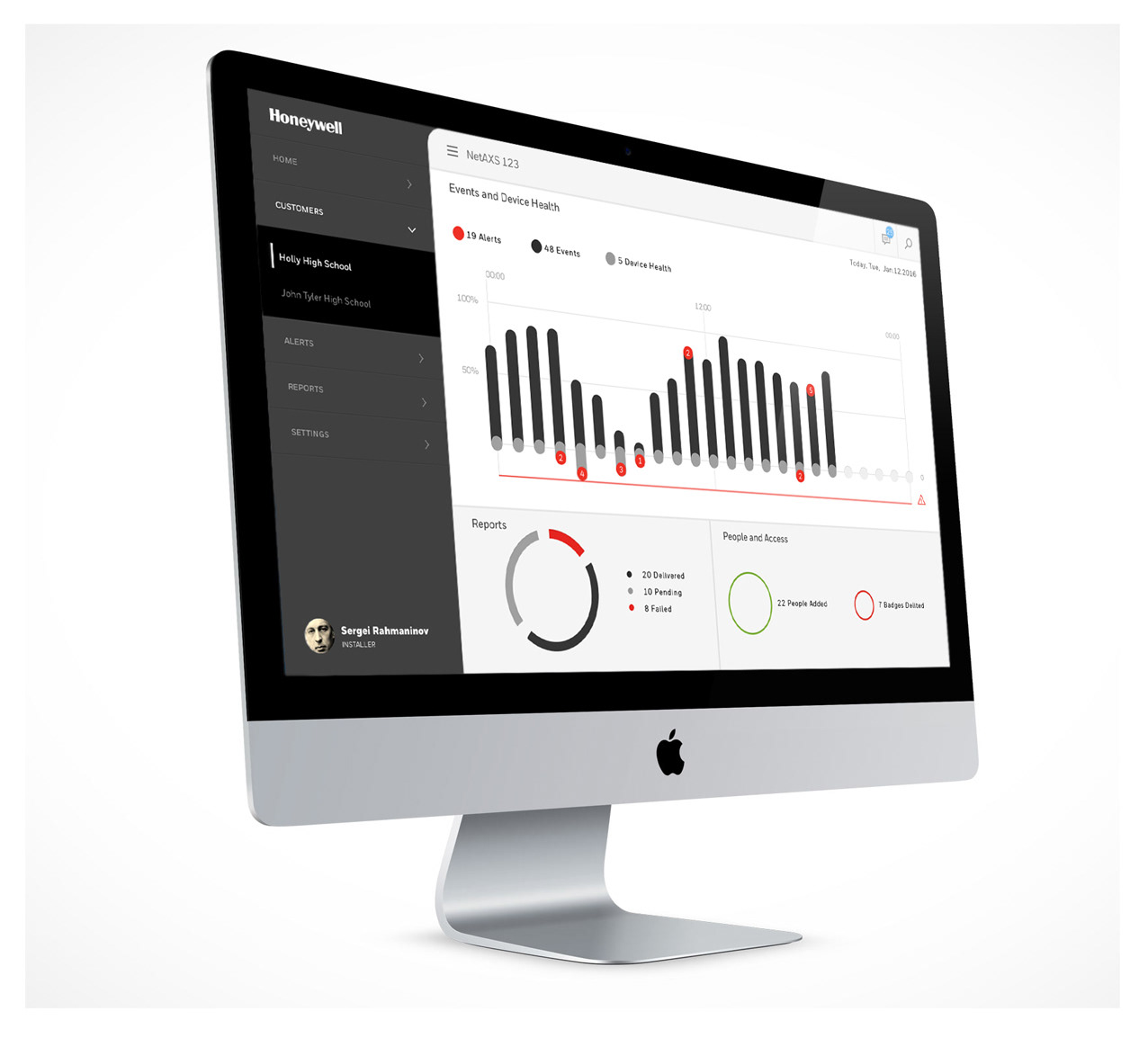
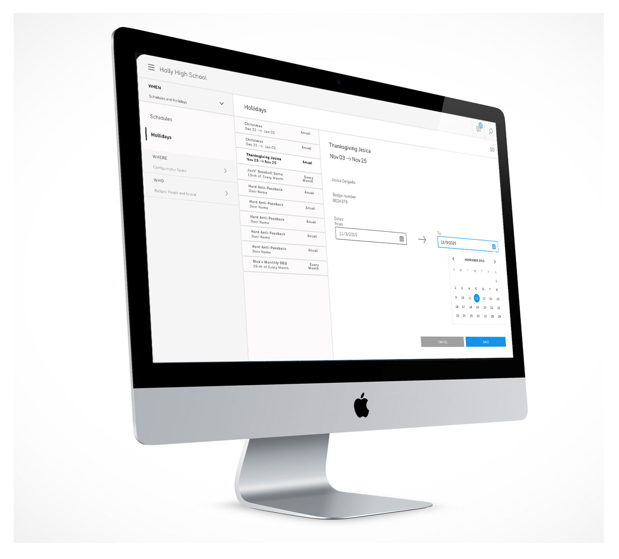
Compare: Display side-by-side comparisons for easy absorption. Honeywell NetAXS 123 - Security System project. B2C.